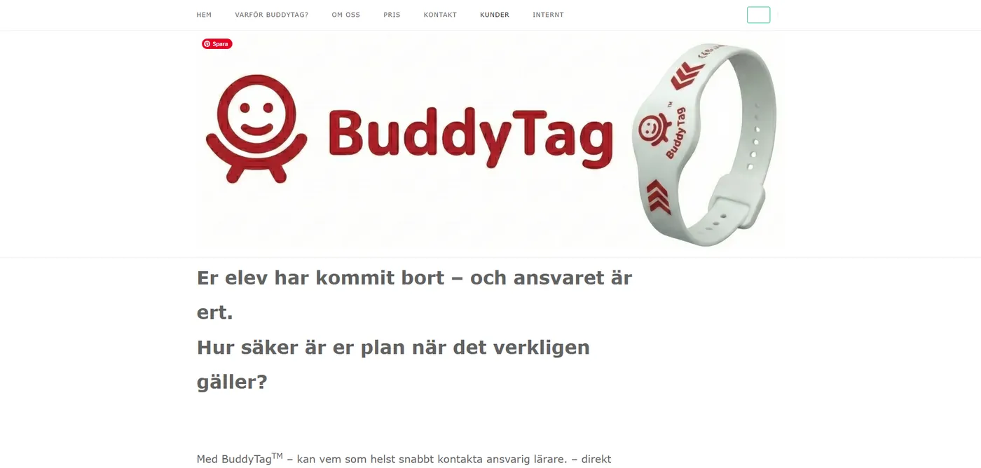
NFC safety wristbands
BuddyTag
Live
BuddyTag makes NFC safety wristbands for children and the elderly — a quick tap with any phone reaches the right people in seconds. I was handed their old site and rebuilt it from the ground up, expanding it into a full multi-page site that feels playful and reassuring at once. It's now live at buddytag.se, in Swedish and English.
The challenge
A safety product has to pull off a balancing act: feel warm and friendly, yet earn real trust — and make a piece of technology instantly understandable. The site needed to show how the wristband works at a glance, make its benefits obvious, and gently guide visitors toward buying, without ever feeling clinical.
What I did
I rebuilt the entire site and shaped the brand around it: clean, scalable SVG logos built on BuddyTag's signature red, one consistent visual language, and a "how it works" flow that makes the technology click in seconds. Their old site was a handful of pages; I expanded it into a proper multi-page site — a story-driven homepage, dedicated tracks for each audience, a segmented pricing structure, an in-depth FAQ, and more. The client wrote most of the copy; the design, structure, information architecture and the way the story unfolds are mine — calmer, more confident, and consistent from the homepage down to the smallest detail. Built in Swedish and English, and now live.
Inside the site
It's a broad site, and every part earns its place:
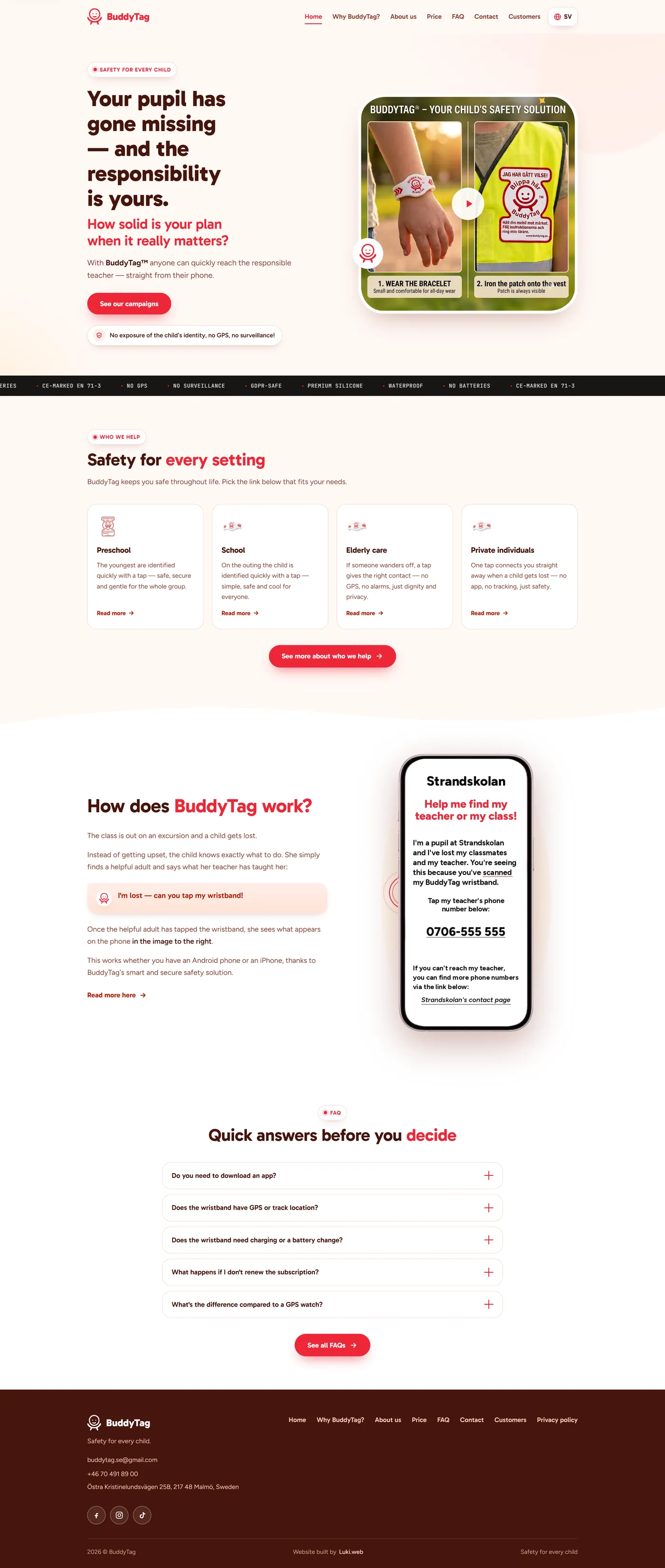
- A homepage that opens on a real scenario — a child gets lost on a school trip — and walks you through exactly what happens next, backed by a short hero film in an accessible in-page player.
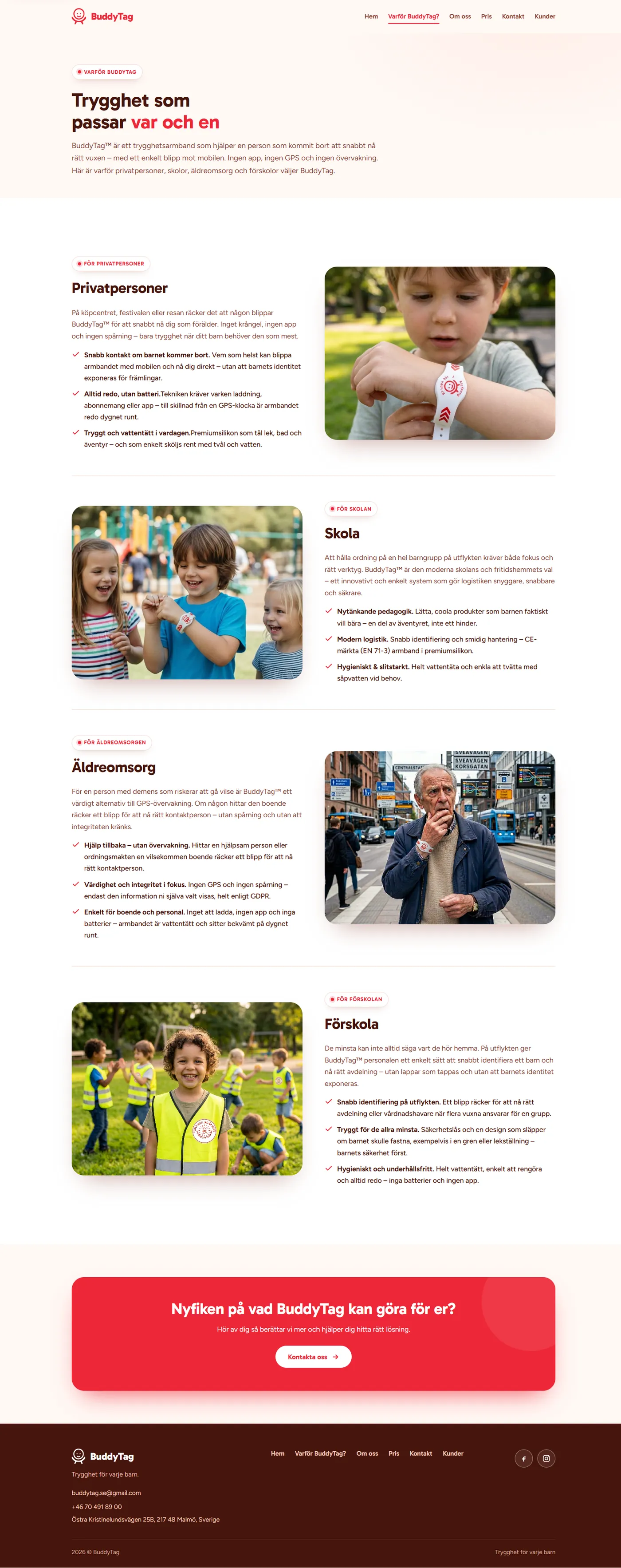
- Four audience tracks — preschool, school, elderly care and families — each addressed in its own words on a dedicated Why BuddyTag page.
- Segmented pricing: a pricing hub that branches into tailored pages for each audience, so schools, preschools, elderly care and private buyers see only what's relevant to them.
- An in-depth FAQ, organised into clear themes: how it works, the technology, privacy & GDPR, materials, who it's for, ordering, and how it compares to a GPS watch.
- An about/story page introducing the people behind the product, a customers page with early pilot feedback, and a contact page with a working, spam-protected form — plus privacy policy, a friendly thank-you page and a custom 404.
Every page exists in both Swedish and English — text and imagery.
Under the hood
The parts you don't see are doing just as much work as the parts you do:
- Easier to find on Google. The site is built the way search engines like to read it — clear signals on every page, a full sitemap and tidy web addresses — so when people search for child or elderly safety, BuddyTag has a real chance of ranking well and being found. Links also show the right title and image whenever they're shared on social media or in a message.
- Fast on every phone. Optimised images, fonts served straight from the site, and nothing unnecessary loading in the background mean pages appear quickly, even on a weak connection. Visitors don't give up and leave — and Google gives faster sites a ranking boost too.
- Safe and private by design. Strict security settings protect the site and everyone who visits, with no tracking of any kind — exactly what you'd expect from a brand built around children's safety and privacy. Secure sites also earn more trust, both from visitors and from Google.
- Swedish and English, instantly. The whole site — words and images — switches language at the tap of a button, so international schools and English-speaking families get the same polished experience as everyone else.
- Works for everyone. It's fully usable with a keyboard and with screen readers, so no visitor is shut out — and the same clean, well-structured code also helps search engines understand the site.
- Enquiries handled safely. The contact form has built-in spam protection and a clear privacy note, and messages come straight to BuddyTag without passing through any outside service.
- Ready to grow. It can even be saved to a phone's home screen like an app, and it's built tidily enough that new pages and features can be added later without starting over.
Proudest of
Taking a serious safety product and giving it a site that feels genuinely friendly and human — while making the technology click in just a few seconds.
Selected screens — desktop & mobile


The original site — before my redesign
The redesign is now live. The screens above are the site as it ships today; below is the original design I was brought in to replace.